Intro
Searching online for right place to stay on your travels can be overwhelming.
Users are often faced with a large number of options, filters, and decisions, making the booking process time consuming and difficult to navigate.
This project explores how to simplifying and improving the booking experience, to help users make faster and more confident decisions.
Define
Current problems with the booking experience
Users often struggle to find the right accomondation when booking online.
The process typically requires multiples filters, comparing several options, and making decisions with limited guidance.
This creates a complex and time consuming experience, where users must rely on their own judgement without support.
As a result, many users feel uncertain about theit choices and abondon the booking process before completion.
User insights
Industry research and user interviews
Many booking platforms experience high traffic but relatively low conversion rates. Users often start the booking process but drop off before completing it, choosing alternative platforms instead.
This raised an important question:
What makes users complete a booking on one platform, but abandon it on another?
To better understand user behaviour and identify common friction points, I conducted usability testing and competitive analysis of existing booking platforms, as well as a survey with 15 participants asking about the previous booking experiences.
The goal was to understand both what works well and where users experience friction.
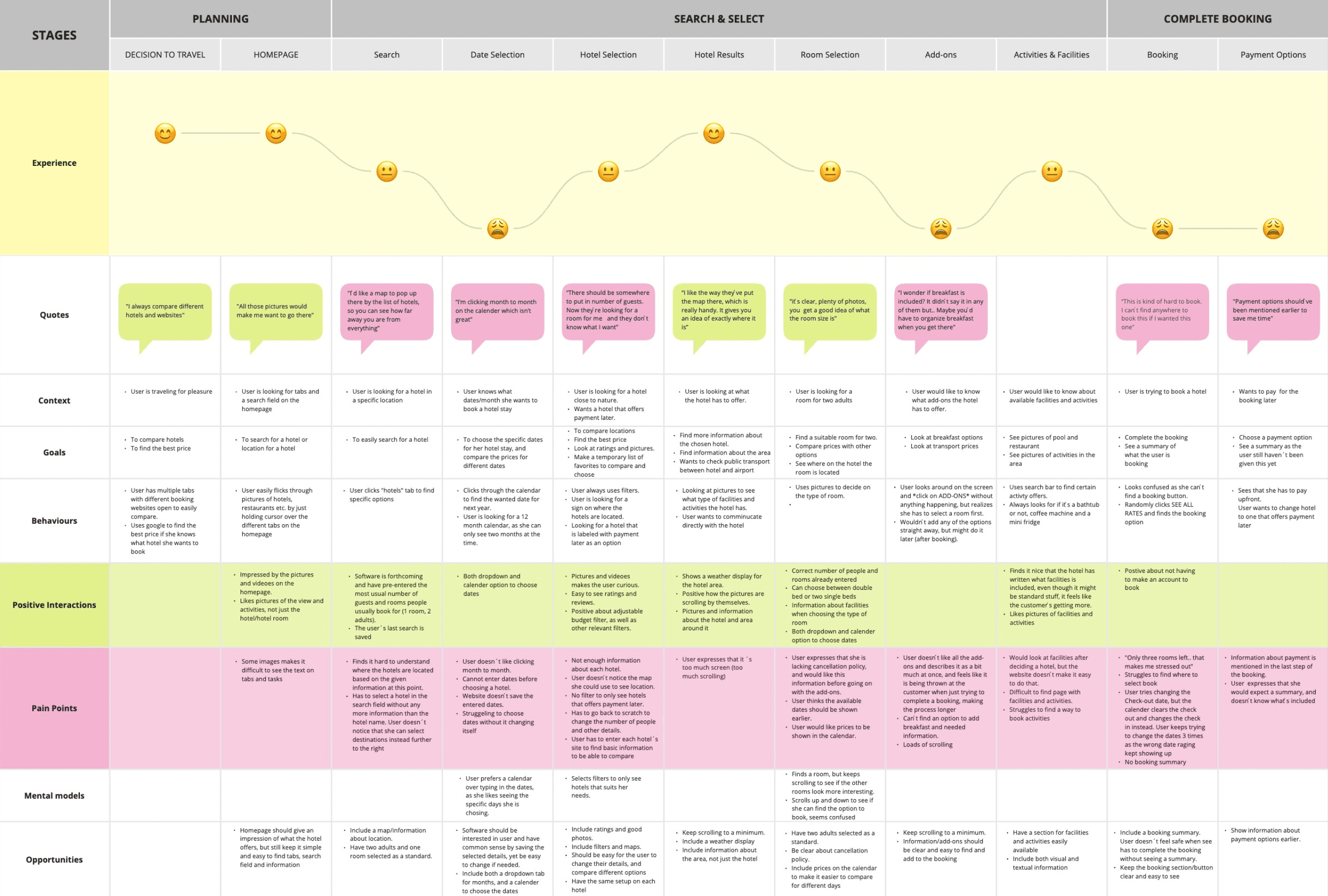
Key insights
Users feel overwhelmed by too many choices and filters
Due to the lack of information or the difficulty of finding it, users look for other options where they can easily find the information they are looking for. This happens when the website does not fit their mental models.
Users do research about several options to compare prices, locations and facilities before booking the accomondation that fits their needs.
Comparing options is time-consuming and mentally demanding, and some users say they use several days to do research before completing the booking.Users are often unsure if they are making the “right” choice
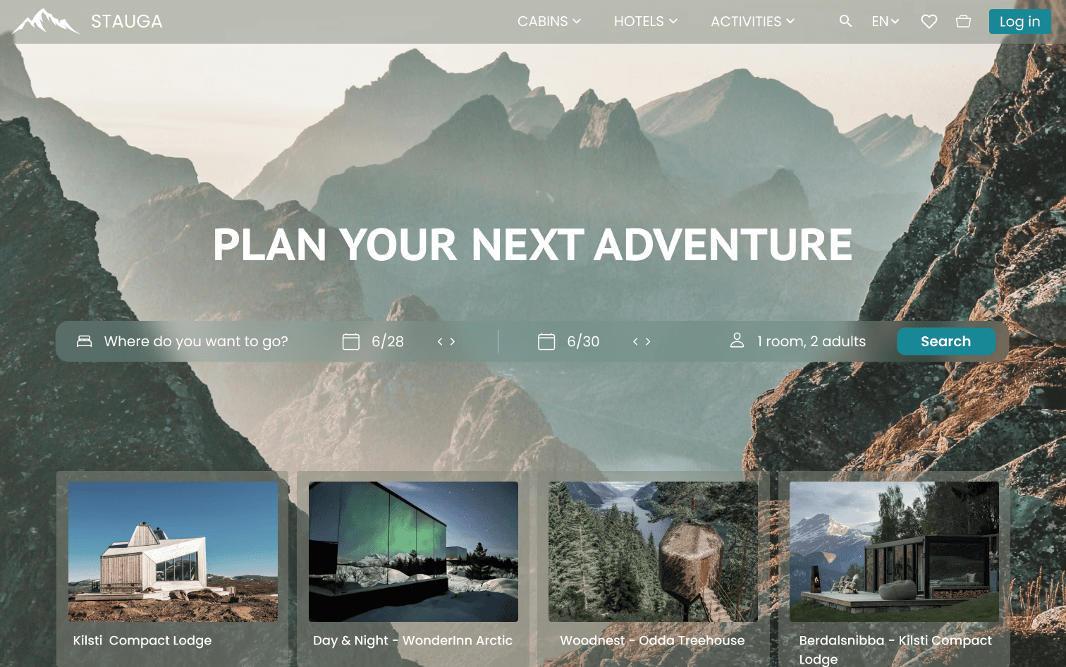
Most users say they prefer a clean homepage, reducing information and ads.
Each page should guide the user on where to interact, and not be overwhelming with too many attention seeking elements at onceA lack of guidance leads to hesitation and drop-off
Visual content plays a critical role in first impressions
Users rely heavily on images to evaluate accommodation options, but readability must be maintained when text is layered on visuals.Users compare across multiple platforms before making a decision
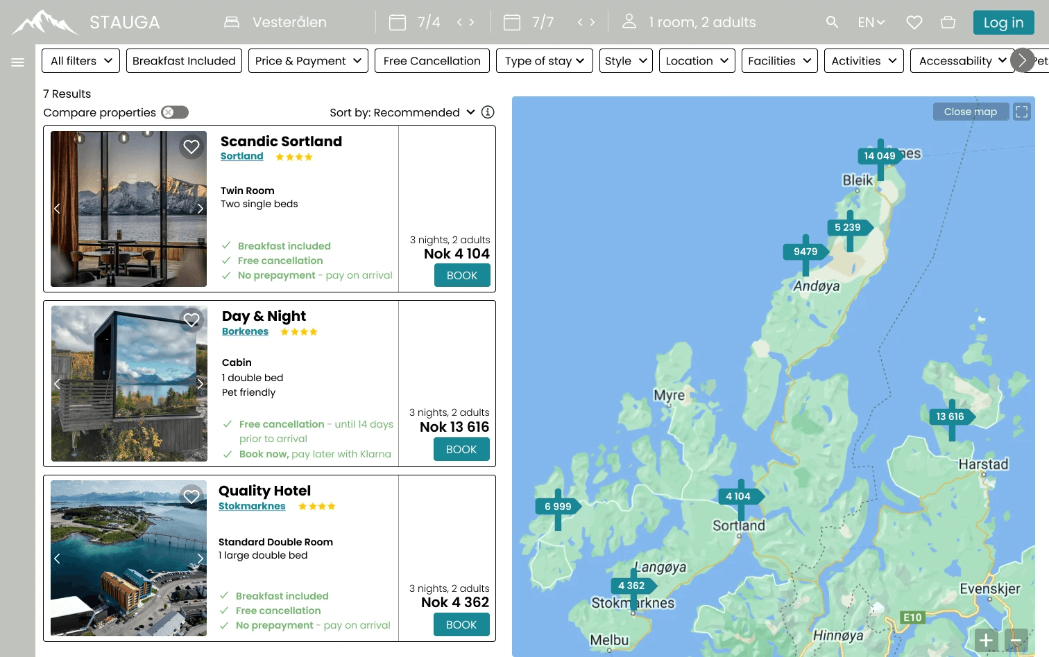
They expect an easy way to compare options, both within a platform and across alternatives.Efficiency and speed are key drivers
Features such as pre-filled information (e.g. number of guests, rooms) and saved searches reduce effort and streamline the booking process.Location is a primary decision factor
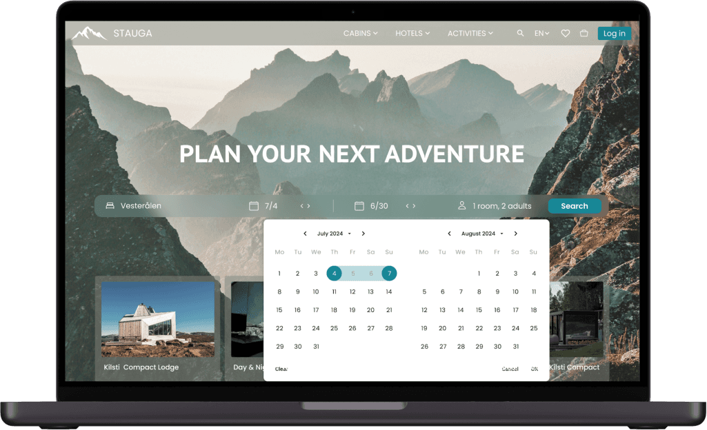
Integrated maps help users quickly assess whether an accommodation meets their location preferences.Date selection should be fast and intuitive
Combining a calendar with dropdown navigation improves usability and reduces the number of interactions required.Filters are essential, but must be easy to use
Users depend on filters to narrow down options, but too many or poorly structured filters can increase friction.Consistency improves usability
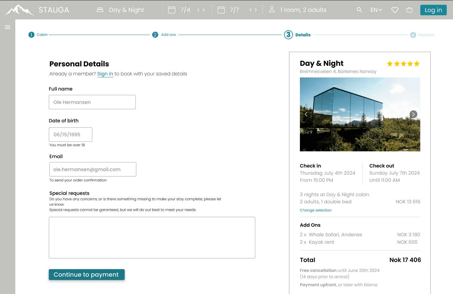
A predictable layout across hotel pages helps users quickly locate key information.Trust and transparency are critical for conversion
Users need clear information about cancellation policies, payment options, and booking details early in the process to feel confident completing a booking.Users prefer a combination of visual and textual information
Both are necessary to support decision-making.Users want to save and compare favourites
The ability to shortlist and compare selected options is highly valued.
Solution
Main design goals
Based on the identified challenges, the goal of this project was to design a more intuitive and guided booking experience that reduces complexity and supports users in making confident decisions.
To achieve this, I focused on simplifying the discovery process and improving how users explore and compare accommodation options.
Key design decisions
Providing clear and essential information and feedback.
This gives the user a feeling of clarity, safety and confidence.Minimizing the number of needed interactions
Making it clear how and where to interact
Simplified search and filtering
Reduced the number of visible filters and prioritised the most relevant options to minimise cognitive load.Improved overview of accommodation options
Introduced a clean, card-based layout to make it easier for users to scan and compare key information such as price, location, and amenities.Stronger visual hierarchy
Designed a clearer structure to guide users through the page and highlight the most important actions.Support for decision making
Focused on presenting essential information in a way that helps users feel more confident when choosing between options.
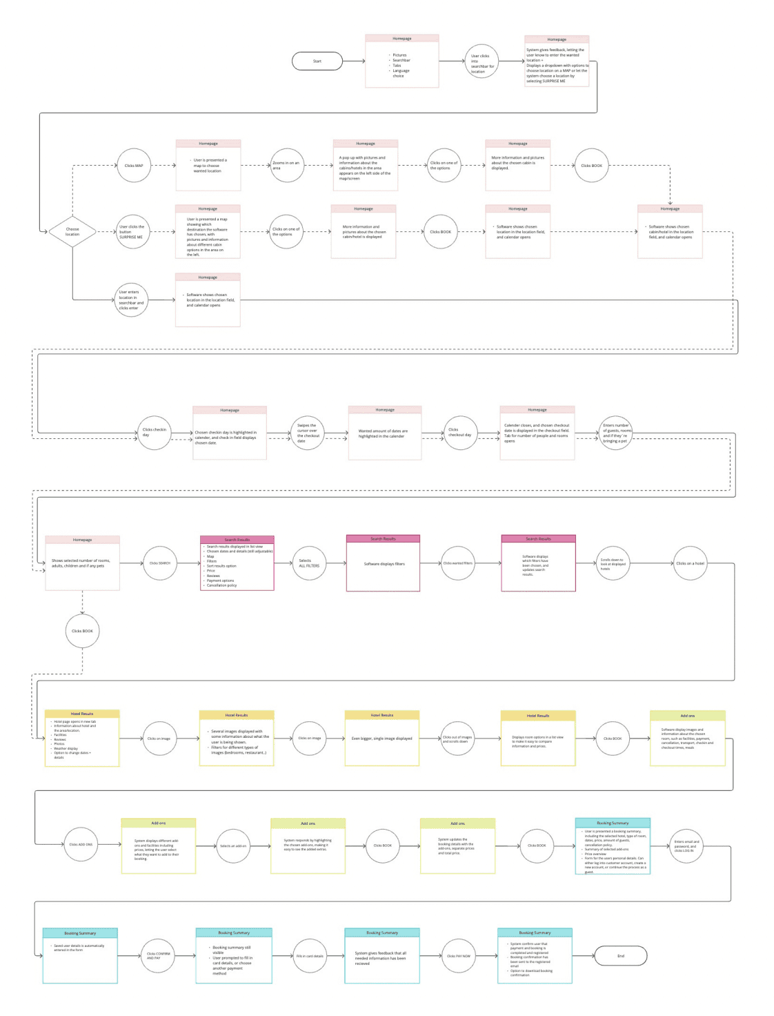
Ideate
Ideating solutions to solve pain points and generating process flow
Interaction Design
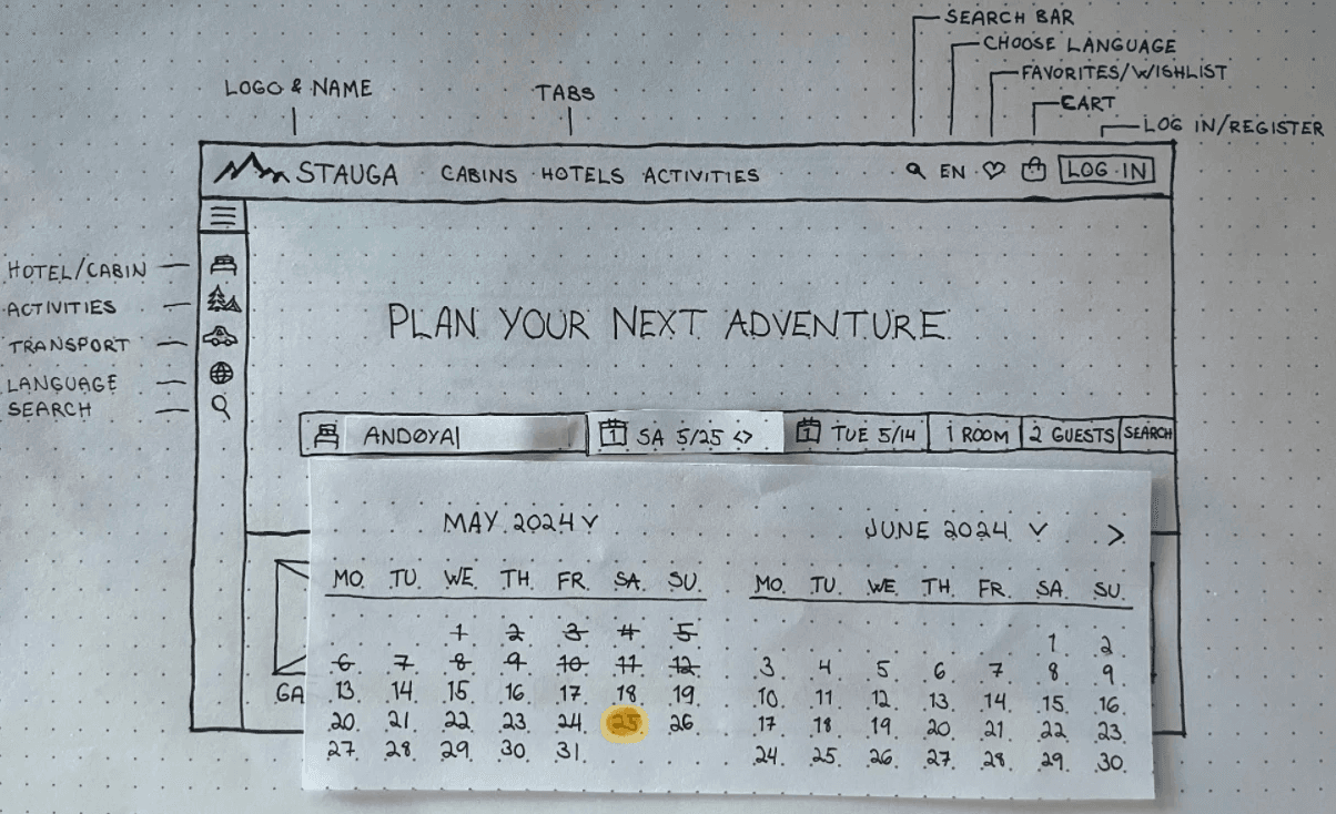
After creating a user flow, I sketched out each screen and interaction to experiment with the layout and elements before making the wireframes in Figma.
As the search bar is one of the first interactions for the user, I wanted to create a solution where interactions were kept to the minimum.
A combination of CTA´s and dropdowns makes it easy to choose their wanted option without unnecessary interactions.
Prototype
Wireframes
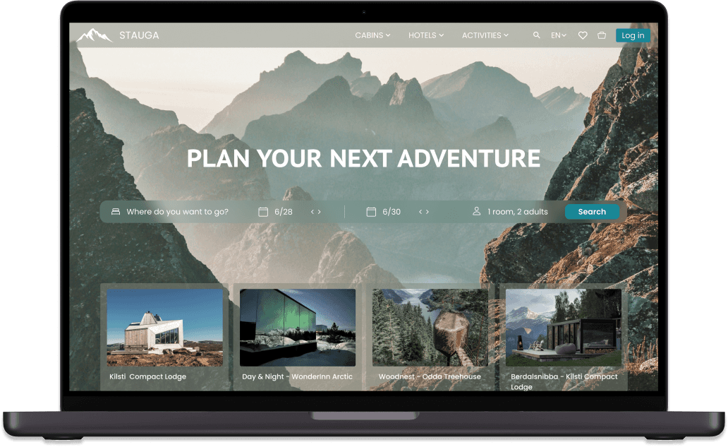
Based on the findings gathered using different research methods, Stauga is created to be a booking website that is easy to navigate, clear on it's feedback, and give a feeling of security.

As a common issue with booking websites is the finding all the needed information for the user feel secure and prepared for their accommodation, I decided to use a combination of a primary and secondary navigation bar.
This combination is used to let the user have access to all information at all times, no matter which step of the booking process they are on.
Filters and dropdowns are also included to let users easily find accommodations based on their wishes, giving them information about which options that fulfills their needs.
The feeling of security is created by giving the user important information early on, such as payment and cancellation policy, reviews, location, and included facilities..
The issue of unnecessary interactions and time spending during the booking process was a common problem that I did not want to pass on to this new company.
The user can therefore do necessary changes in their booking information easily throughout the process in the horizontal navigation bar.
A long process with too many steps can make the user choose to end it, even when they are close to the final step.
Including a progress bar will give information to the user about where they are in the process, and how many steps they have left.
In addition to the progress bar, I have included some small encouragement messages to let the user know how they are doing.
Reflect & grow